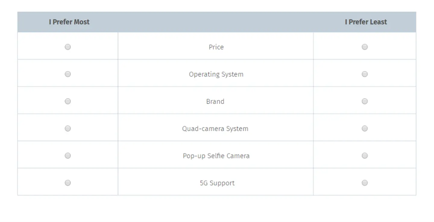
With limited time, money, and screen space, we usually aren’t able to fit all of the features we’d like to into a single design. Instead, we rely on feature prioritization to help us choose which features will make the cut. This is where MaxDiff survey analysis comes in.
MaxDiff surveys are a useful UX research tool because they allow us to quantify a user’s top priorities. You’ll walk away with concrete numbers that prove quite helpful when making big decisions involving all stakeholders.
So why use MaxDiff instead of ranking scales?
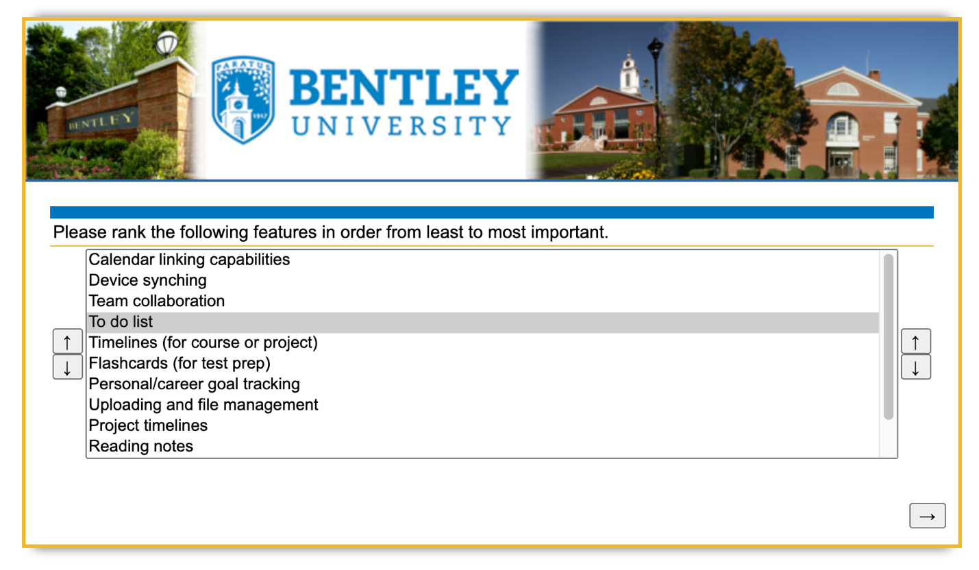
While traditional ranking scales ask respondents to rank a set of features from least to most important, instead of allowing respondents to point to many features as similarly important, MaxDiff forces users to choose only the least and most important options within a set of three to five features.
1. Setting up your survey.
Let’s imagine your team is building a project management tool for grad school students and you need to decide which features to include.
Before you run your survey, you’ll want to work with project stakeholders to decide on a set of features to test. A typical MaxDiff exploration involves a comparison of 12-25 features (1). This range offers you the optimal number of comparisons in order to best gauge each feature’s relative importance.
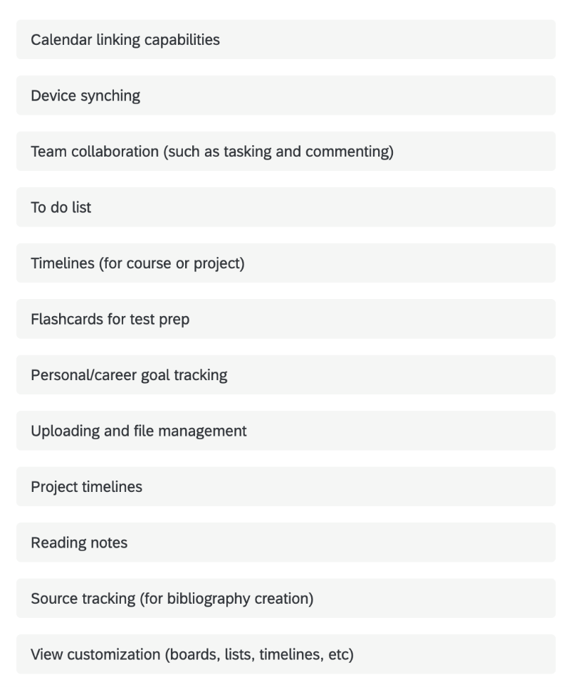
Here’s an example list of feature ideas for the project management tool example mentioned above:
Next, you’ll also want to decide which survey tool you’ll use. For this example, I used Qualtrics, which offers a MaxDiff survey option that makes recommendations, automates feature randomization, and provides detailed reporting.
You’ll also want to plan to have at least 100 respondents take your survey. If at all possible, shoot for a minimum of 200 (2).
2. How a MaxDiff survey works.
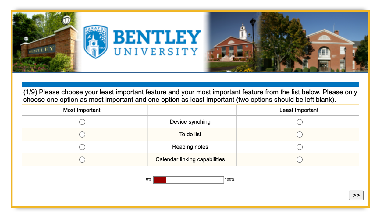
- Your set of features will be randomly divided by your survey tool into < 25 subsets with 3-5 features each. (Each subset = one question).
- Respondents will be shown each feature subset and asked to choose their single least and single most important features.
- Respondents will see each feature once, but not necessarily every combination of features (1).
3. Striking a balance in the breakdown of features to questions.
Of course, the goal of the MaxDiff survey is to collect rich comparison data. The more subsets you show respondents, the more data you’ll collect showing how each feature compares to the others. Your scores will also be most accurate if each feature is shown the same number of times.
However, one of the biggest issues with MaxDiff is respondent fatigue. Because respondents see the same features several times during a survey, it can start to feel very repetitive and even confusing. Keep these two best practices in mind to help minimize respondent fatigue:
Again, your survey tool will automatically suggest the appropriate number of questions in your survey, the number of features in each question, and the number of optimal responses.
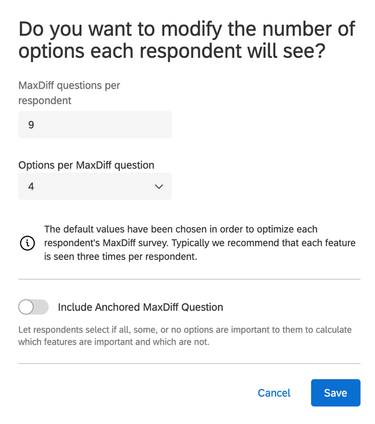
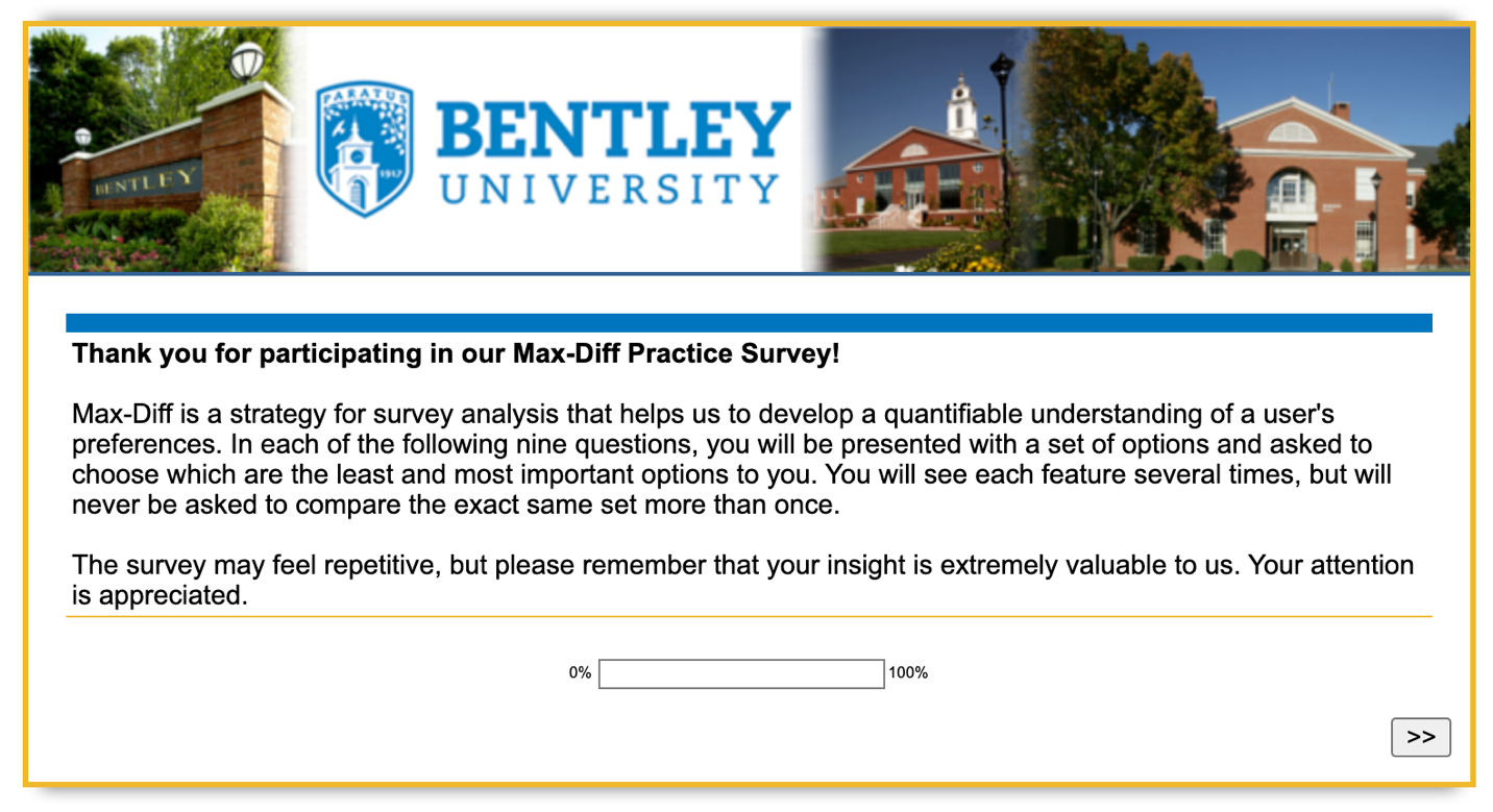
Also, make sure to let your respondents know what to expect in the survey so they don’t get confused and start to wonder why they’re seeing the same features repeated.
4. Analyzing the data.
MaxDiff surveys can be analyzed through MaxDiff scores (1), which show the utility, or value, of each feature (4). This entails subtracting the number of times an answer was chosen as least important from the number of times it was chosen as most important, then arranging these scores around a mean. Above-average scores are then considered to be relatively more important to users, while below-average scores are considered less important (1).
But thankfully, when using a survey tool like Qualtrics, you’ll get to bypass clunky Max-Diff score calculations in exchange for a set of reports at the end that capture the idea of feature utility in a variety of different ways.
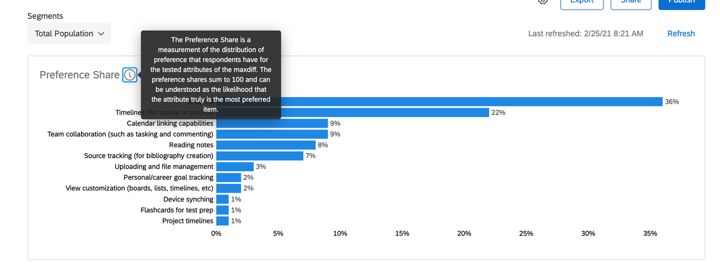
For example, the Preference Share Report shows feature preference broken down as a percentage.
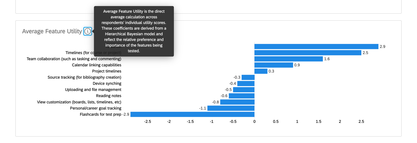
And the Average Feature Utility Report shows the preferences arranged around a mean. This is similar to a MaxDiff score, but determined using the more sophisticated Bayesian Hierarchical (HB) model (3).
5. Don’t forget to ask “why.”
MaxDiff is an excellent tool for gauging preference, but it doesn’t tell the whole story (1). Respondents aren’t asked to explain their response rationales, which means you might be left wondering why a particular feature won out over others.
Also, keep in mind that survey responses, in general, don’t always mimic real-world actions. For instance, a graduate student may not think they need device synching, but in practice, they may switch back and forth between their computers and phones more than they think.
For best results, pair MaxDiff data with interviews or other qualitative research methods that would help you understand more of the whys behind MaxDiff data.
Sources:

Mariah Ore is a Research Associate at the User Experience Center. Before joining the team, she worked as a freelance copywriter, contracting for branding and web design agencies such as Avitus Group and HalfLyte Digital. In these roles, she crafted brand messaging, planned information architecture, and created user flows and wireframes for client web projects. Mariah is also a writer and multimedia creative.
Mariah holds a BA in English Literature and Creative Writing from the University of Montana and is currently pursuing a Master of Science in Human Factors in Information Design at Bentley University.


