According to the Information Architecture Institute (IAI), Information Architecture (IA) dictates “how to arrange the parts of something to be understandable.” IA is everywhere in our lives—it’s how you organize storage space in your kitchen; how books are arranged in libraries; and it’s also found in the virtual world, in how designers structure the content in websites and software. A good IA makes sense to people, so it's easy to find pertinent information.
A tree test is the standard method to determine if an IA is usable. It “evaluates a hierarchical category structure, or tree, by having users find the locations in the tree where specific tasks can be completed,” according to Kathryn Whiteton from Nielson Norman Group. For one of our projects at the Bentley User Experience Center (UXC), we used the Treejeack tool from Optimal Workshop (OW) to help a well-known consulting company run two tree tests on their website. The goal of the study was to understand if two different target personas could easily navigate the website and find the information they needed.
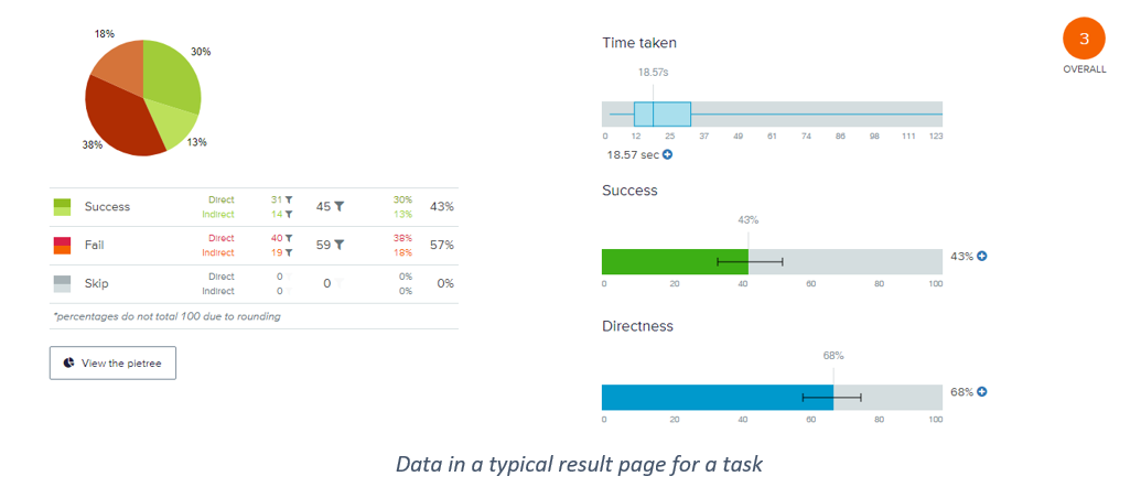
To truly understand a website’s IA performance for each intended audience, researchers must spend hours carefully examining all the test data. Failing to perform this due diligence can lead researchers to wrong conclusions. Let’s look at the standard data researchers need to examine on a typical test result page, as shown below.

“Time Taken” shows the time it takes for participants to finish a task, but it provides no indication of the level of depth for target information of a task. As a result, although two tasks may have similar completion times, each task's level of depth may be different. “Success rate” is another metric that shows the percentage of users who could complete the task. It does not, however, provide any indication of any back-and-forth users may need to go through to complete the task. “Directness” shows the percentage of participants who went straight to their final answer without backtracking. However, it fails to address the extent of “indirectness.” It treats participants that backtracked once, the same as participants who backtracked several times.
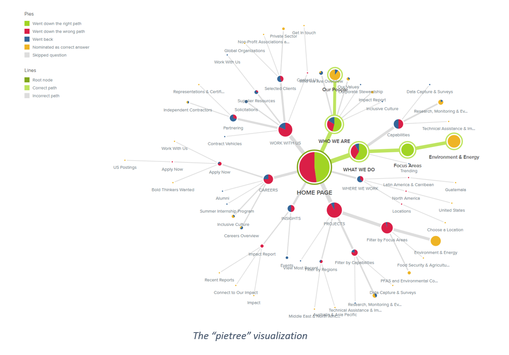
One of the key visualizations within Treejack is a “pietree.” The “pietree” shows the entire IA journey of participants - everywhere participants visited on the website. Every “pie” represents a tab within the website. The larger the pie, the more participants that have been there. Different colors represent different participant behaviors; for example, green represents participants that “took the right path,” and red means participant “took the wrong path.” As you can see, the graphic is packed with colors, and it is visually overwhelming and challenging to comprehend.

This is when I saw an opportunity to create a tool to make data analysis in a tree test more efficient, so I proposed the “Struggle Index.” The Struggle Index (SI) is meant to complement Treejack’s capabilities in two ways. First, the SI shortens the time spent analyzing data by identifying the tasks participants struggled to complete so that researchers can allocate their attention while reviewing data and prioritize their focus. Second, it quantifies the back and forth, or the “struggle” that the participants endured while working through the tasks.
The formula to calculate the Struggle Index (SI) is:
SI = (Total Visited During x Reset Ratio)/100%
The SI contains two underutilized data points from the Treejack result: Total Visited During and Reset Ratio. “Total Visited During” is the sum of “Visited During.” Unlike the “Visited First” that only records the very first click of each primary level tab, “Visited During” keeps track of the percentage of participants that visited different primary level tabs throughout a task. In the highlighted column to the right, “Visited During” shows that 28% of all participants had been to the “Who We Are” tab, 37% to the “What We Do” tab and the “Total Visited During” percentage, in this case, is 136%. The higher percentage, the more participants struggled, so they had to click back and forth to find the information they needed.
The second data point is the “Reset Ratio.” It shows how frequently participants feel lost and reset their navigation by clicking on the home button. It is calculated by dividing the “visits to home page” by the “participants count.” The “visits to home page” can be found in the “pietree visualization,” as shown below.
Now, let’s look at the example of task 2 & 3 from the project. Task 2 asked the participant to look for the “new contract information,” and task 3 asks for the “past client information.” As shown in the chart, participants struggled to find the information in both tasks. Task 3 has a lower success rate (5% vs. 8%), it took longer for participants to finish (25.89s vs. 21.96s), and fewer participants went directly to the menu that allowed them to complete the task (54% vs. 62%). These metrics suggest that while both are not ideal, participants performed slightly worse in task 3 than task 2.
However, the Struggle Index (SI) indicates otherwise, the participants actually struggled significantly more in task 2. The SI of task 2 is 3.86 comparing to 2.67 in task 3. The “Reset Ratio” in task 2 is at 214.42%, which means, on average, participants clicked the home page twice to reset! “Visited During” confirms this notion with a metric of 180%, suggesting that participants went to different primary level tabs to find information.
So, what caused the terrible performance in task 2? If you recall, task 2 asked the participant to look for the “new contract information.” It turns out that on the client’s website, this information is placed under “who we are,” which is not where participants expected to look, so the participants went to different tabs to find the answer.
If introduced early to the analysis process, the Struggle Index would allow researchers to strategically allocate their attention while reviewing data and better prioritize their focus. To move this finding forward, I would apply the SI in more tree test projects to further validate, modify, and finalize this method.

Yuning Desmond Fang is a Research Associate at the User Experience Center. Prior to joining the UXC, he worked as a landscape architect at Weston & Sampson, a multi-disciplinary engineering firm in Boston. In this role, he helped designing public parks, playgrounds, urban open spaces, and track & field complexes throughout the United States.
Desmond holds a Bachelor of Landscape Architecture from Utah State University. He is currently pursuing a Master of Science degree in Human Factors and Information Design from Bentley University.


