Three Steps to Designing Online Communities
Published on July 24, 2017 by Flavia Stoian
Forums are as old as the Internet. Before Social Media, Forums and IRC are what brought people together in the virtual space. But in the world of Social Media, remote teams and collaborative tools, where do forums fit and how can they complement other tools to bring distinct value?
Forums are asynchronous methods of communication, where participants are not online all at once and discussions happens at a slower pace. Communication is easier to moderate, curate and control and has a bigger longevity than live chat or social media feeds. Discussions are contained and focused and lack the noise of social media. If social media is the big party where your users huddle together to chat in a corner, a forum is the book club where they meet in the library room every other week. Due to the nature and the design behind a forum, users need to make bigger efforts in being present and engaging with each other, and to keep contact, they will need to regularly come back and check for updates. From my experience, often they socialize and bond with other users. Ideally, in a good forum, the community will take ownership and, together with the curators, they will create and foster a culture based on consistent engagement and sharing.
Here are three design steps that curators and forum owners can take to achieve user engagement:
1. Build Empathy for Your Users— design for change and foster power users and influencers.
2. Make Things Easy to Search and to Find — Allow the user to recognize elements of interest. Build good navigation, with consideration for the hierarchy of the knowledge base. If the users can’t recognize elements of interest right off the bat, build robust search options. Your goal is to make the user’s journey from point A to point B fast and painless.
3. Curate, Simplify and Iterate! — Empathize, shave the unnecessary, test, reiterate. Repeat.
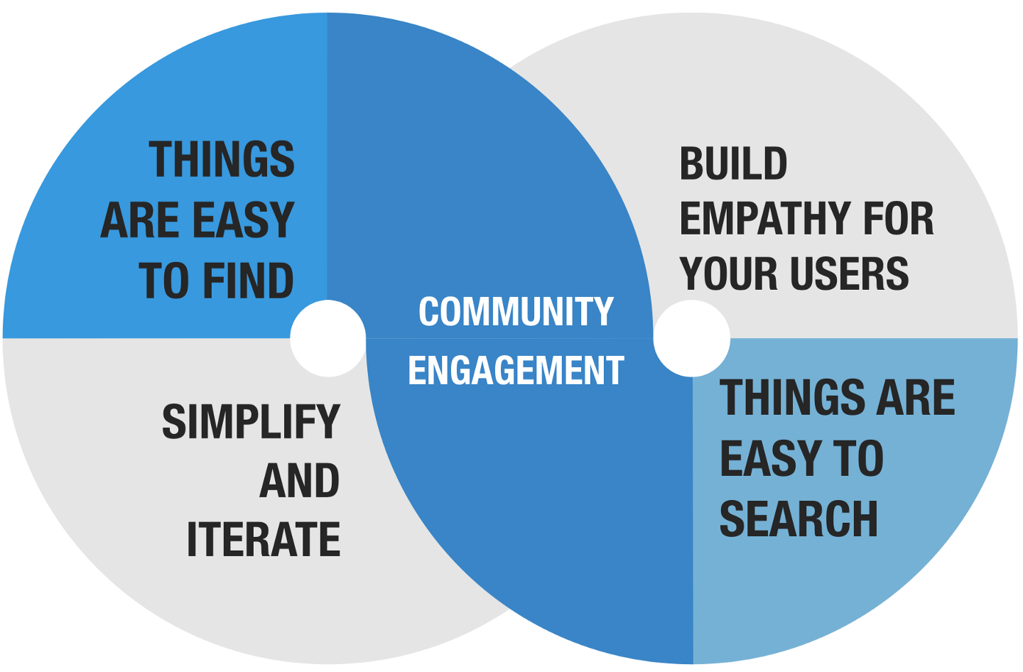
Let’s talk a bit about how to achieve each step.
1. Build Empathy for Your Users
1.1. DESIGN FOR CHANGE
Think of it as you would design a children’s park: First, you would want to know who uses the rides: is it for public use, is it for a kindergarten, who comes there, who stops where, when and why, etc. Then you would want to design the rides accordingly, to foster the adult-child relationship or focus on collaborative activities between children. It’s the same with a forum:
Define your users, define the behaviors you want to encourage and then design accordingly.
Your goal is to trigger a sense of responsibility for sharing information and because every community is different, a subtle individualization can make for a highly-engaged forum.
To focus the objectives of your research on behaviors, ask some of these questions:
- How do people find your forum?
- How do they spend their first two minutes on your forum?
- When do they decide to register for your forum?
- What makes them post something on the forum for the first time?
- What makes them lurk the forum or stop posting?
- What makes them “come back” to the forum once they’ve quit?
While I was doing a similar study on online communities, I used MindNote to visualize the primary behavioral changes around the research objectives. Here is a small section of the Mind Map that resulted:
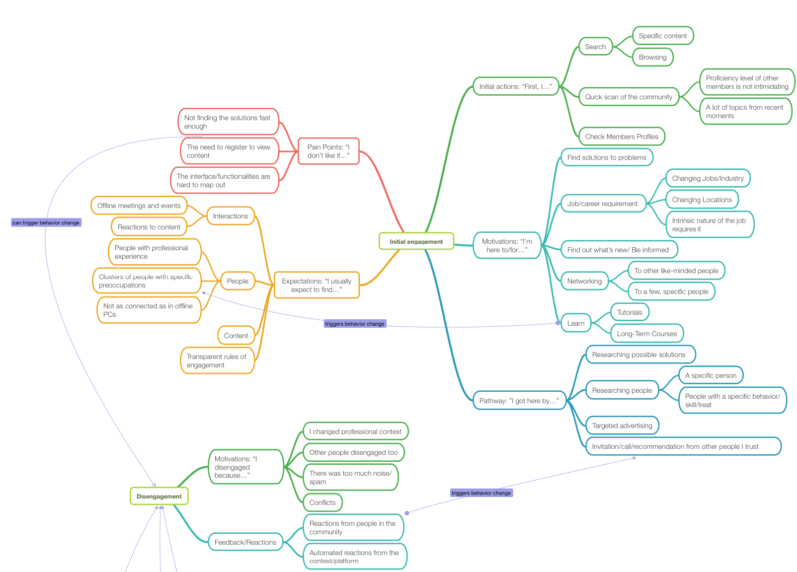
The light green captions derived from the objectives of the study: In this section, you can see the “Initial Engagement” — translated from “Why and how do people land on a forum” and the “Disengagement” — translated from “Why and how do people leave a forum?” The behavioral change is highlighted when the study revealed a clear pattern of action from the user.
1.2. DESIGN TO FOSTER USER LEADERSHIP
Having power users and influencers is crucial for a forum — but they need to be incentivized and empowered, sometimes in different ways than regular users.
Some brief highlights from my study showed that:
Around 50% of the users I interviewed said that they would feel empowered if given the opportunity to act from a position of authority in the community and they would dedicate more attention and time on the site.
Regular users saw the opportunity of becoming a moderator as an incentive and they would strive towards it if they were engaged with the community as a whole.
Some of the power users, on the other hand, almost saw it as a right and felt entitled to it.
Some power users mentioned they would have disengaged with the community if their merit would not have been acknowledged.
2. Make Things Easy to Search and Find
The chance of users finding what they need improves as the volume of information decreases. Users find things by name or symbols that they recognize. To make things easy to find, you need to build good navigation, with consideration for the hierarchy of the knowledge base and make use of graphical cues and symbols.
2.1. SHORTCUTS TO THE HOT AREAS
One of the wheels that do not need reinventing is that a forum needs shortcuts, most popular being to the most recent discussions or the most popular ones.
Here’s some shortcuts to consider:
- Global Navigation
- Most Recent discussions
- Most Popular discussions
- Links to last or first page of thread.
2.2. USE GRAPHICAL CUES AND TAGS
I don’t remember life before hashtags. What a fun way to virtualize labels! Make use of hashtags but don’t leave the responsibility of using them only to the user. Showcase hashtags wisely, preferably within a widget that continuously updates the list and pushes the most popular ones on top.
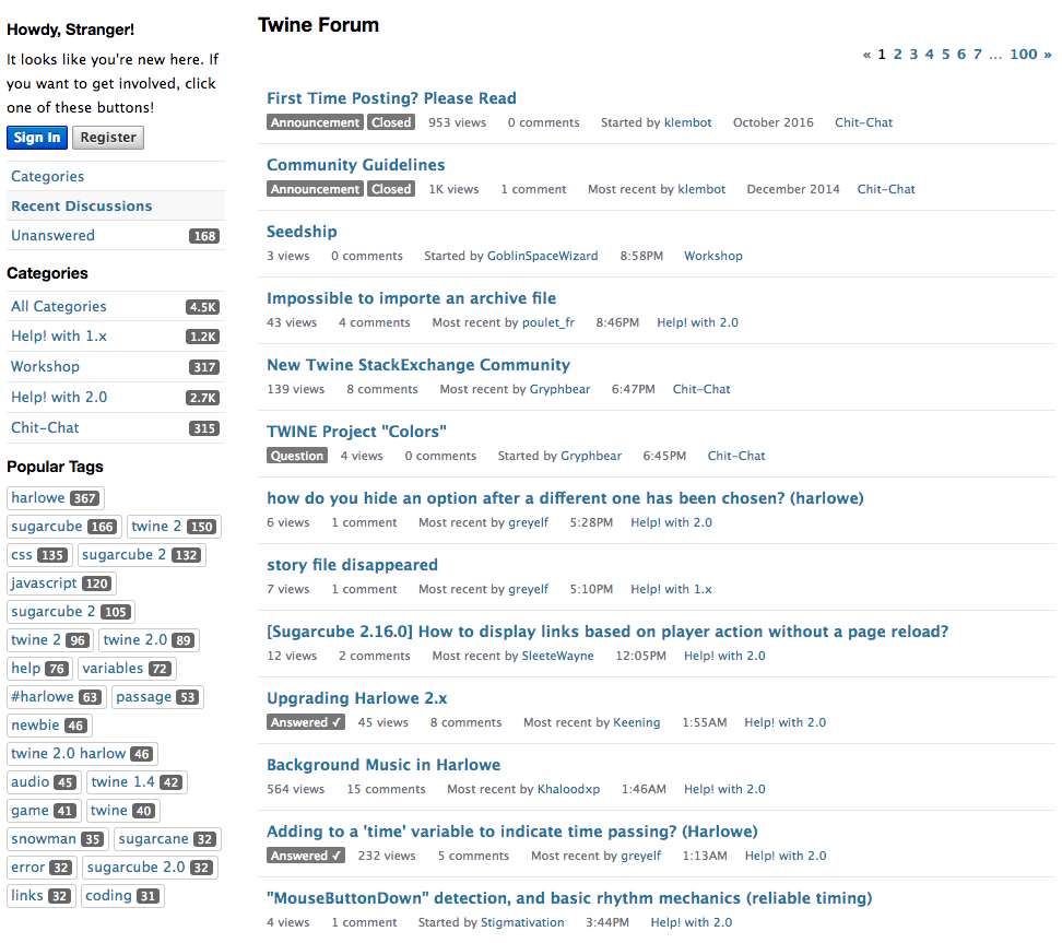
Twine Forum home page showcases the “popular tags” according to how often they were used in describing the topics (Source: https://twinery.org/forum/discussions/tagged/sugarcube)
2.3. DEFINE THE MAIN TOPICS AND HOW THEY BRANCH OUT INTO SUB-TOPICS AND SHOW IT ON THE GLOBAL NAVIGATION
-
Use pre-existing mental models to name the main topics. Categories, sections, forums, topics, call them as you like but make sure you pivot into pre-existing mental models and the name itself does not add to the cognitive load of the user. It’s easier to understand and remember the hierarchy between “Topics” and “Sub-topics” than between “Sections” and “Forums”.
-
Be very selective about your main topics and test them with your users. Do they think those topics would virtually cover all possible discussions? Do they believe that some might be redundant? As you branch out, you may allow for more elements on the same hierarchical level.
-
Make the main topics visible at all times on the global navigation and be aware of the relationships between the main topic, a sub-topic and the threads under each sub-topic and make the hierarchy as transparent as possible to the user.
The global navigation of The Student Room (below) showcase the main sections of the forum and the most popular forums on the global navigation. It’s hard to understand the relationship between Sections and Forums; at a closer look, the Sections are the top level topics and the Forums are the sub-topics.

https://www.thestudentroom.co.uk/
The FIFA Forum (below) has two global navigations, one on top, one to the right. The top one has the Categories (top level hierarchy) and the Discussions (lowest level hierarchy, taking the user to the most popular or recent discussions). The Menu to the right shows the hierarchy of topics: the main categories and their expandable sub-categories.
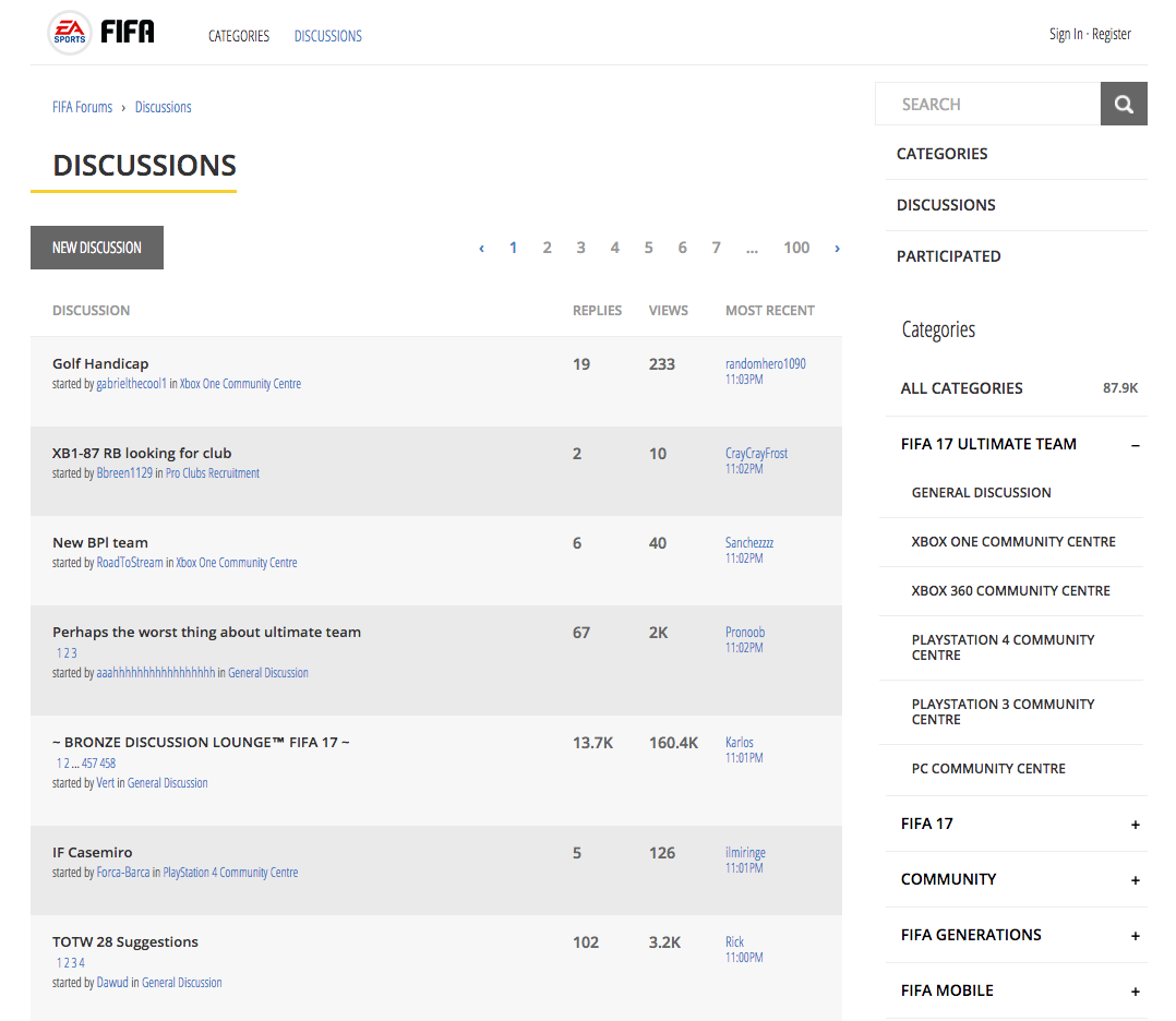
http://fifaforums.easports.com/en/
Don’t try to create too many categories and sub-categories, hoping that threads will not overlap. There’s a balance between too many categories and usability. You would rather have overlapping threads than having 154 sub-topics. And, knowing that, you can take measures to offset the overlapping of topics.
2.4. OFFSET OVERLAPPING DISCUSSIONS
With a large knowledge base, it is impossible to avoid overlapping threads. You might have a discussion among users that relates to two sub-categories or even two or more main categories at once. The first step to offsetting this is to acknowledge it and be comfortable with the mess that comes with any discussion board. It’s okay to be so and trying to constrain people into posting to different categories will chase them away.
Instead, think of the negative effect of the overlapping: it makes it hard for people to search information of interest. That’s why it’s important to put a lot of thought into the filtering system and the overall searchability of the forum.
2.5. MAKE THINGS EASY TO SEARCH
People search information by problem or by cues, generally, what they recall as being associated to what they need. To make information easy to search, you need to build robust search functions.
Building good search functions is a topic thoroughly researched, and it should always convey the fastest route a user can take between wanting to search for something and getting the result they want. A few rules of thumb:
- Use long and permanently visible search bars that allow the user to see the whole string of text they input.
- Use familiar symbols like the magnifying glass
- Use good defaults to pre-populate data. These vary according to the user base: it can be the most recent searched topics or the most popular one or location based, etc.
- Use auto-suggestions or hints in the search bar.
Having a sophisticated search function is a decision at the crossroad of user needs and design principles and should be the subject of user testing. The decisions revolve around the search options and how many should be made available, the white space, the grouping, and the UI but the panel should always:
- Be entirely visible above the fold;
- The selected search options should be visible and the user able to delete them quickly.
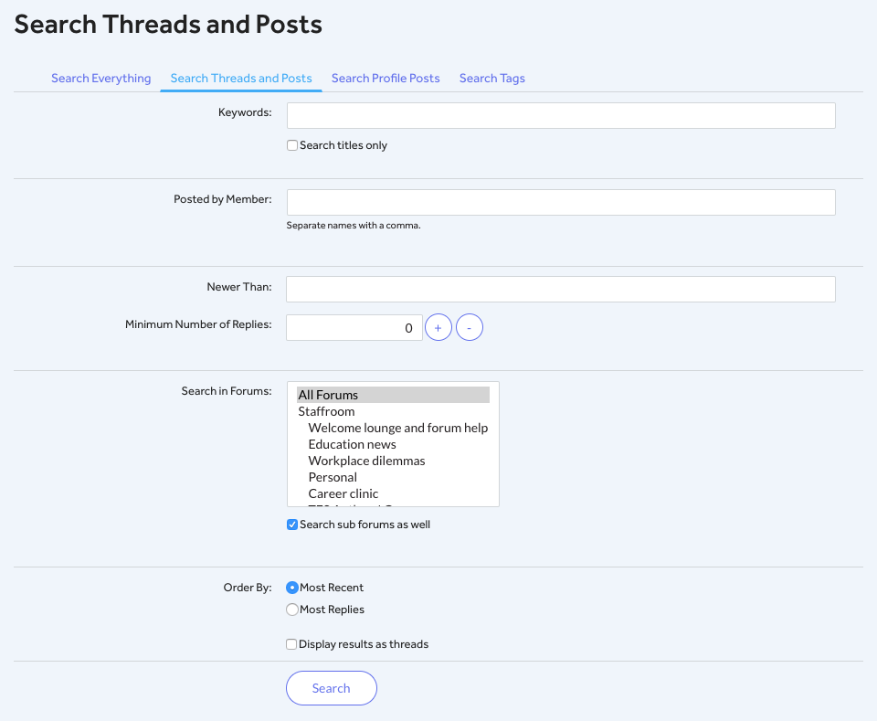
TES Community (below) has a built in complex search function. Notice the long search bars and the fact that the default selected tab is “Search Threads and Posts” which probably is the most popular tab among the four.
3. Curate, Simplify and Iterate.
In other words, slash the status quo information and replace it with what’s meaningful to your users, which, on a forum, most likely, is to:
- Find relevant information fast and painless
- Engage with other users
After you went through the whole design process, go back to the board, browse the design and mark all the elements that you feel they do not add value to these goals. Let me give you an example. If you’ve been the member of a forum, you might have seen the lines of information that follow the user’s photo on their posts. In a recent usability evaluation, we ran with our consultancy, we revealed that people were either indifferent to it or outright against it. Our users did not know what “Karma” stands for and they would have loved to see other relevant information there, like what kind of position the person has.
Then test, redesign, test again, engage with the users, be part of the community and be nimble to change.
Conclusion
There is a wealth of good resources to help you design and build an excellent forum. But the most successful discussion boards out there are, in fact, relying on members’ engagement and their generosity to share information and take part in the community life. Thus, UX guidelines like the ones above should always be used for scaffolding community engagement and user goals.

Flavia Stoian is a Research Associate at the User Experience Center. Before joining the UXC, Flavia was an academic lecturer, teaching and doing research. In her role as an educator, she has developed a set of instruments for student-centered learning in higher-education, which she later published. After working for several years in business and financial consulting, she founded and owned Whims Media, a start-up that provided full-fledged integrated e-learning corporate solutions, which she exited after four years. She is an active enabler for NGOs in the field of education, technology and equal opportunities for women. She has a thorough understanding of cross-cultural environments as she pursued various international programs in France, UK, Eastern-Europe, Chile and South Africa. She is passionate about designing for social change and emerging technologies.
BACK TO ALL UXC BLOGS
Let's start a conversation
Get in touch to learn more about Bentley UX consulting services and how we can help your organization.


