
Welcome to the Bentley.edu Website Component Library!
Below, you'll find helpful resources:
Need help with your edits? Submit a support ticket here.
For a video guide on website components, click here.
Jump to Page Components
Use the links below to quickly navigate to a specific component without scrolling.
Anchor Links
Hero
Stats Hero
Content with Header
Content with Header Boxed
Section Divider
Card Grids
Decorative Card Grid
Circle Card Row
Event Localist Feed
Logo Gallery
Stats Grid
Featured Posts
Gallery Grid
Featured Articles
Content Feed
Youtube Playlist Player
Video Card Grid
Callout
Accordion
Poll
Teaser
Slim Callout
Slideshow
Blockquote
Person Slider
Percard
Tabs
Countdown Timer
Anchor Links
Anchor links are a way to help users navigate to specific sections within the same page. To use them, you first assign a unique ID (for example, “AnchorLinks”) to the section you want to link to by entering it in the Anchor Name field within the component editor. Then, you add #goto- to the end of the page’s URL followed by your anchor name. When someone clicks that link, the browser automatically jumps to the section with the matching ID. This is especially useful for long pages, as it improves usability by allowing users to access specific content instantly without needing to scroll.
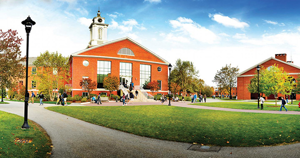
Hero
The Hero Banner is a large, full-width feature area used for impactful imagery paired with a title and optional buttons. This component is typically placed at the top of a webpage to immediately grab attention and direct users to important actions or information.
Recommended Image Size: 1440x720 pixels
Content with Header
This is where content should be placed. This element is primarily designed for text or text-heavy content presentation. It offers flexibility in layout by allowing content to be either boxed (see below), providing a distinct boundary around the text, or unboxed for a more fluid integration with the surrounding page elements. Additionally, users have the option to utilize just the content box for neatly stacking text under another element or section, or to employ only the header section to provide clear titles for various sections of the page.
Content with Header Video Tutorial
Content with Header Boxed

This is where content should be placed. Percipit postulant no sed. Ex sed iusto epicuri, pri nostrud accumsan nominavi at, est wisi dolor cu. Ex vis mazim eruditi phaedrum. Pri hinc ubique oporteat no. Ius no labore omittam praesent, cu usu senserit deseruisse. Eu dolore scripserit complectitur nec, audiam alterum incorrupte has at. Qui nibh verear laboramus ei, ad pri enim minimum constituam. Ex sed iusto epicuri, pri nostrud accumsan nominavi at, est wisi dolor cu. Ex vis mazim eruditi phaedrum. Pri hinc ubique oporteat no. Ius no labore omittam praesent, cu usu senserit deseruisse. Eu dolore scripserit complectitur nec, audiam alterum incorrupte has at. Qui nibh verear laboramus ei, ad pri enim minimum constituam.
Section Divider
This element is a visual tool used to separate content on a webpage. It's ideal for delineating different sections or topics, enhancing organization and readability. This element offers flexibility in design, allowing for various styles such as horizontal lines, shapes, or patterns. It can be seamlessly integrated into the page layout, providing clear boundaries without overpowering surrounding elements. Users can customize the divider to suit their needs, ensuring a cohesive and visually appealing browsing experience.
Recommended Image Size: 800x450 pixels
Card Grids

'None' Variation #1
This is where content should be placed. Image should be 3:2 and less than 2MB. Mattis enim ut tellus elementum sagittis vitae et leo. Risus quis varius quam quisque. Est velit egestas dui id ornare arcu. Neque egestas congue quisque egestas diam in arcu. Ultricies leo integer malesuada nunc.

'None' Variation #2
This is where content should be placed. Image should be 3:2 and less than 2MB. Ornare massa eget egestas purus viverra. Fermentum dui faucibus in ornare quam viverra orci sagittis eu. Amet mattis vulputate enim nulla aliquet. Cursus mattis molestie a iaculis at erat.
Background Color Only Variation #2
This is where content should be placed. Volutpat maecenas volutpat blandit aliquam etiam erat velit scelerisque. At tempor commodo ullamcorper a lacus vestibulum sed arcu non.

Background Image Variation #1
This is where content should be placed. Image should be less than 2MB. Nibh sit amet commodo nulla facilisi. Posuere lorem ipsum dolor sit amet consectetur adipiscing. Amet purus gravida quis blandit. Eu mi bibendum neque egestas.

Background Image Dark Variation
This is where content should be placed. Image should be less than 2MB. Hendrerit gravida rutrum quisque non tellus orci ac auctor. Amet purus gravida quis blandit turpis cursus in. Vitae tortor condimentum lacinia quis vel eros donec.


Background Image Variation #2
This is where content should be placed. Nullam non nisi est sit amet facilisis. Orci a scelerisque purus semper eget. Euismod in pellentesque massa placerat. Id semper risus in hendrerit.
Colored Border Card #2
This is where content should be placed. Est sit amet facilisis magna etiam tempor. Arcu dui vivamus arcu felis bibendum ut tristique. Donec enim diam vulputate ut pharetra sit. A scelerisque purus semper eget duis.

Heading Stripe Variation
This is where content should be placed. Image should be 3:2 and less than 2MB. Ac turpis egestas maecenas pharetra convallis. Dis parturient montes nascetur ridiculus mus mauris. Donec pretium vulputate sapien nec sagittis aliquam.
Decorative Card Grid
The Decorative Card Grid component displays multiple cards over a shared background image, creating a unified visual theme. It’s great for grouping related content while adding a dynamic and polished feel. Each card can include a title, text, and optional button.
Recommended Image Size: 1200x800 pixels
Decorative Card Grid
This component features a row of cards with a shared background image. Ideal for showcasing related content, it blends individual card details with a unified aesthetic, adding a dynamic touch to webpages.
Card 1
Title and body text is required in this element as well as an image. The image will take up the entire card grid as shown. Links and link text can be added but are optional features. Lorem ipsum dolor sit amet, consectetur adipiscing elit. Sed do eiusmod tempor incididunt ut labore et dolore magna aliqua. Ut enim ad minim veniam, quis nostrud exercitation ullamco laboris nisi ut aliquip ex ea commodo consequat. Duis aute irure dolor in reprehenderit in voluptate velit esse cillum dolore eu fugiat nulla pariatur. Excepteur sint occaecat cupidatat non proident, sunt in culpa qui officia deserunt mollit anim id est laborum.
Link 1Card 2
Lorem ipsum dolor sit amet, consectetur adipiscing elit. Sed do eiusmod tempor incididunt ut labore et dolore magna aliqua. Ut enim ad minim veniam, quis nostrud exercitation ullamco laboris nisi ut aliquip ex ea commodo consequat. Duis aute irure dolor in reprehenderit in voluptate velit esse cillum dolore eu fugiat nulla pariatur. Excepteur sint occaecat cupidatat non proident, sunt in culpa qui officia deserunt mollit anim id est laborum.
Card 3
Lorem ipsum dolor sit amet, consectetur adipiscing elit. Sed do eiusmod tempor incididunt ut labore et dolore magna aliqua. Ut enim ad minim veniam, quis nostrud exercitation ullamco laboris nisi ut aliquip ex ea commodo consequat. Duis aute irure dolor in reprehenderit in voluptate velit esse cillum dolore eu fugiat nulla pariatur. Excepteur sint occaecat cupidatat non proident, sunt in culpa qui officia deserunt mollit anim id est laborum.
Link 2Circle Card Row
This website component consists of a row of circular cards, offering a modern, visually appealing way to present information or navigation options. Unlike traditional rectangular cards, the circular shape draws attention and can serve a variety of purposes, from simplifying site navigation to highlighting key information in a stylish manner.
Recommended Image Size: 600x600 pixels
Examples of uses for circular cards include:
- Navigation items: Circular cards can act as dynamic buttons that guide users to different sections of a webpage or application, enhancing the user experience with their distinctive shape. Example
- Feature highlights: Use them to spotlight special features, services, or products, making these elements stand out on the page. Example
- Team introductions: Perfect for showcasing team members or staff, circular cards can personalize the user experience by presenting each individual's photo or icon in a friendly and engaging format. Example

Navigation Example Option 1

Navigation Example Option 2

Navigation Example Option 3


Events Localist Feed - 3 Card Grid
Localist is Bentley’s centralized event management and calendar platform used to create, organize, and publish campus events.
The Event Localist Feed component pulls event data from Localist to automatically display upcoming campus events in a 3-card or photo grid layout. Event content updates dynamically as new events are added in Localist.
Recommended Image Size: 940x557 pixels
Event Locatlist Feed - Photo Grid
Events Localist Feed - List
Events Localist Feed - Calendar
Event Card Grid
The Event Card Grid component is designed for manual entry of event details, including descriptions and registration links. This intuitive interface ensures organizers can easily showcase events and direct attendees to sign up.
Logo Gallery
The Logo Gallery component displays the logos of companies, collaborators, or sponsors in a responsive and visually appealing layout. This is commonly used to highlight strategic partnerships, trusted brands, or featured organizations.
Recommended Logo/Image Size: 1000x562 pixels


Stats Grid
The Stats Grid component is a versatile tool designed to showcase key statistics and data points in a visually appealing and easily digestible format.
The Stats Grid component displays key data through "Stat," highlighting the main numerical value, "Stat Label," providing context to the Stat, and "Statistic Description," offering detailed insights about the data.
98%
Job Placement Rate
Career Services
Stat
Stat Label
Statistic Description
$73K
Median Starting Salary
Career Services
#4
Most Innovative
U.S. News & World Report
Featured Posts (blog only posts)
The Featured Posts component dynamically showcases the three most recent or selectively chosen posts.
Gallery Grid
The Gallery Grid component displays images in rows of four. If only two or three images are added, they will be left-aligned. This layout is ideal for showcasing event photos, campus scenes, or group activities. For a clean and cohesive look, ensure all images in a row are the same height. Test Last Modified Schema.
Recommended Image Size: 900x600 pixels


Callout
The callout element is designed to draw attention to specific content on a webpage. Primarily used for highlighting important information or key messages, it offers versatility in layout and presentation. Its customizable design and emphasis on visual prominence make it an effective tool for directing user focus and enhancing the overall user experience.
Callout
Callout Title
Callout Subtitle
Accordion
An accordion item is like a foldable section on your webpage. Imagine it as a little tab you can click to drop down more information. Each accordion has a title that tells you what's inside, and when you click on it, the section expands to show more details. This setup is perfect for FAQs, guides, or any content you want to keep tidy and accessible without overwhelming your page.
Lorem ipsum dolor sit amet, consectetur adipiscing elit. Sed do eiusmod tempor incididunt ut labore et dolore magna aliqua. Ut enim ad minim veniam, quis nostrud exercitation ullamco laboris nisi ut aliquip ex ea commodo consequat. Duis aute irure dolor in reprehenderit in voluptate velit esse cillum dolore eu fugiat nulla pariatur. Excepteur sint occaecat cupidatat non proident, sunt in culpa qui officia deserunt mollit anim id est laborum.
Lorem ipsum dolor sit amet, consectetur adipiscing elit. Sed do eiusmod tempor incididunt ut labore et dolore magna aliqua. Ut enim ad minim veniam, quis nostrud exercitation ullamco laboris nisi ut aliquip ex ea commodo consequat. Duis aute irure dolor in reprehenderit in voluptate velit esse cillum dolore eu fugiat nulla pariatur. Excepteur sint occaecat cupidatat non proident, sunt in culpa qui officia deserunt mollit anim id est laborum.
Lorem ipsum dolor sit amet, consectetur adipiscing elit. Sed do eiusmod tempor incididunt ut labore et dolore magna aliqua. Ut enim ad minim veniam, quis nostrud exercitation ullamco laboris nisi ut aliquip ex ea commodo consequat. Duis aute irure dolor in reprehenderit in voluptate velit esse cillum dolore eu fugiat nulla pariatur. Excepteur sint occaecat cupidatat non proident, sunt in culpa qui officia deserunt mollit anim id est laborum.
Poll
Designed for quick feedback from the community aimed at enhancing user interactions.
Please submit a ticket to add poll to your website.
Teaser
Recommended Image Size: 700x500 pixels

Featured Articles
The Featured Articles component displays a curated selection of content in a visually prominent layout. This component is ideal for spotlighting important updates, announcements, or stories in a flexible, eye-catching format.
Slim Callout
A Slim Callout component, designed to seamlessly blend into various web page layouts, features a choice between dark grey and light grey color schemes to match the website's theme. It includes a title and a subtitle, allowing for a concise yet impactful message delivery. To accommodate different calls-to-action or navigational options, this component can support up to four buttons, offering flexibility in directing user engagement or facilitating website navigation. The slim design ensures the callout is unobtrusive, maintaining the webpage's aesthetic while effectively drawing attention to key information or actions.
Slim Call Out (Gray)
Callout Subtitle
Slim Call Out (Dark Gray)
Callout Subtitle
Slideshow
A visual component that cycles through multiple images or content panels, allowing users to browse featured content, announcements, or highlights within a single space.


Before and After Slider


Blockquote
The Blockquote component offers two styles: a simple quote display or a "Fancy" version with a circular image and background color. Great for testimonials, pull quotes, or highlighting notable voices, both versions include optional fields for the speaker’s name and title.
Recommended Image Size: 400x400 pixels

Person Slider
The Person Slider is designed to showcase multiple individuals in a sleek and engaging format. It allows users to switch between different profiles, making it perfect for team introductions, speaker showcases, or professional portfolios. Each profile includes a professional headshot, name, title, contact information, department, and a brief bio.


Person Card
The Person Card component provides a detailed snapshot of an individual, including a headshot, name, title, department, phone number, email address, and a short biography. It's ideal for use on team pages, staff directories, or contact sections where consistent and clear presentation of personnel is needed.
Recommended Headshot Size: 400x400 pixels

Dr. Mateo Cruz is an award-winning teaching-scholar at Bentley University. His primary research focuses on diversity, equity, inclusion, social justice (DEIJ), and change in groups & organizations. His research has been published in top management and psychology outlets including, Journal of Organizational Behavior, Journal of Vocational Behavior, and Research in Organizational Change and Development and presented to academic and executive audiences in the US, UK, and South Africa.
As a scholar-practitioner, Mateo’s work is guided by one central goal: To design and deliver evidence-based interventions that advance change leaders at the intersection of identities. He holds 20+ years of experience as an executive coach and organization development & change (ODC) consultant & trainer specializing in inclusive leadership, group & team dynamics, and organizational change.
Content Feed
The Content Feed component automatically displays a dynamic list of content items, such as news, events, or blog posts, based on selected filters. It pulls content from specific content categories and is ideal for keeping pages up-to-date on content without manual updates.

Bentley Announces New Presidential Faculty Fellows
During their year-long appointments, faculty fellows will lead projects to expand curricul…

Tabs
Tabs are a user interface component that organizes content in a compact, space-efficient manner, allowing users to switch between different views or sections of content without leaving the page. They consist of horizontally aligned titles that, when clicked, display the content related to that title, making them perfect for grouping related information in a clear and accessible way.
Stat Hero
The "Stat Hero" is a visually striking component designed to showcase key statistics or achievements through bold typography and dynamic visuals, making impactful data immediately stand out on a webpage.

Stat Hero
75%
Stat Label
Statistic Description
Stat
Stat Label
Statistic Description
Stat
Stat Label
Statistic Description
stat
Stat Label
Statistic Description
Youtube Playlist Player
This component allows editers to add entire YouTube playlists onto component pages. Features a large main player, clickable video list with thumbnails, and automatic next-video playback. Includes customizable background options so each page can have a unique look, and is fully responsive for all devices.
University Partnerships
Bentley University builds strong partnerships with leading corporations, academic institutions, and community organizations to create hands-on learning opportunities and real-world impact. Through these collaborations, students connect classroom knowledge with professional experience, gain valuable industry insights, and develop the skills to thrive in a global business environment.
Countdown Timer
A dynamic component that displays a live countdown to a specific date and time. It’s commonly used to build urgency for upcoming events, deadlines, launches, or registrations by showing days, hours, minutes, and seconds remaining.
Countdown Timer
June 13, 2026
- days
- Hours
- Minutes
- Seconds
Video Card Grid
The video card grid on Bentley University's website is a visual and interactive layout designed to display multiple video cards in an organized manner. Each video card represents an individual video with a title, thumbnail image, and brief description. Here’s a detailed explanation:

Virtual Tour: The Reimagined Adamian Academic Center at Bentley University
Lorem ipsum dolor sit amet, consectetur adipiscing elit, sed do eiusmod tempor incididunt ut labore et dolore magna aliqua.

